WhatsApp Quick Reply Buttons and Interactive Lists: When to Use Them, with Examples
Quick reply buttons, interactive lists, and link buttons let customers tap instead of type, so your bot understands them the first time. Learn how they differ, the limits of each, and when plain text is better, with salon, restaurant, oud, and dates examples.
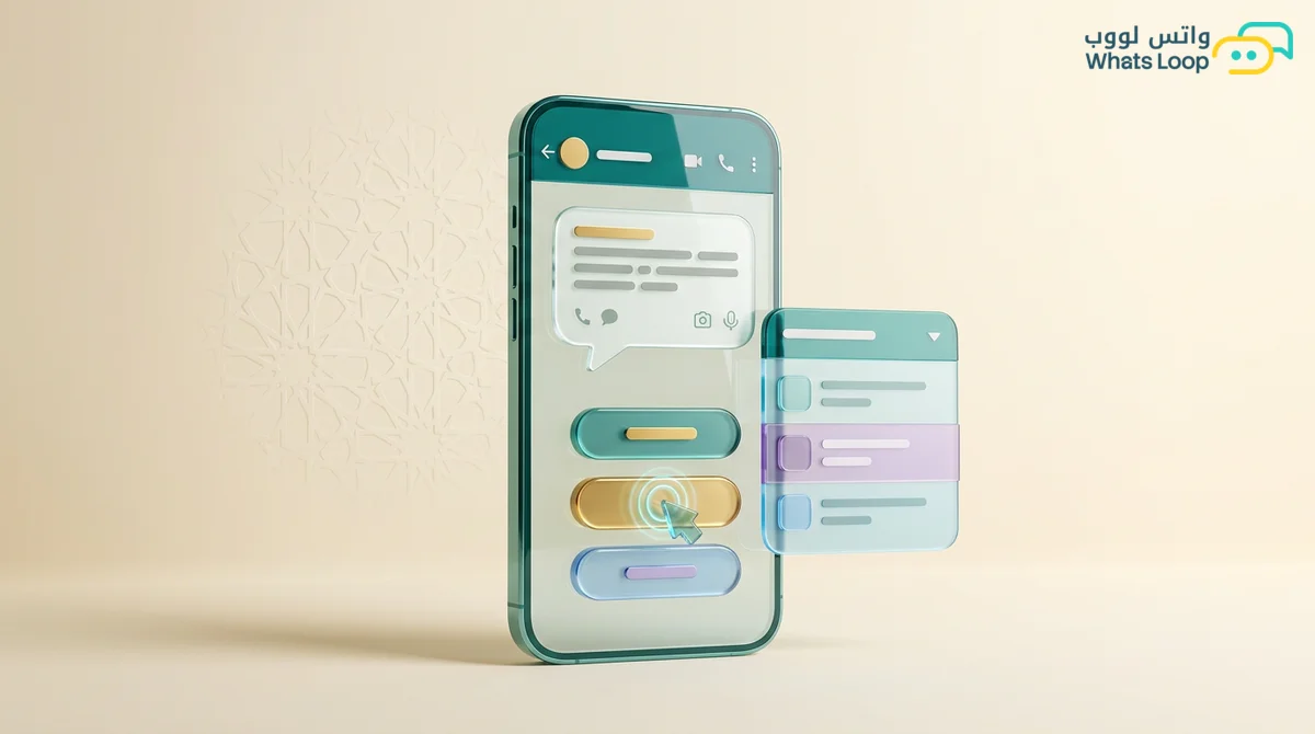
Short answer: WhatsApp API interactive messages come in three main types. Quick reply buttons give customers up to 3 options to tap instead of typing, interactive lists open a menu of up to 10 options organized into sections, and call-to-action buttons open a link such as a product page, payment page, or map, with these figures according to Meta's documentation at the time of writing. Use buttons when options are few and clear, a list when there are more, and a link button when you want the customer to take a step outside the chat. Keep plain text for open questions and replies that need detail.
Most merchant bots we see start with "Send 1 for orders, 2 for prices, 3 for delivery". The customer types "I want to order" instead of a number, or types the digit in Arabic numerals, the bot does not understand, and it repeats itself. Buttons and lists fix that at the root: the customer taps instead of typing, the bot receives an unambiguous choice, and the conversation moves much faster.
The three types at a glance
Here are the core limits according to Meta's documentation at the time of writing:
| Type | Options | Button or option text | Best for |
|---|---|---|---|
| Quick reply buttons | Up to 3 buttons | Up to 20 characters per button | Yes or no, confirmations, a few choices |
| Interactive list | Up to 10 options across up to 10 sections | Up to 24 characters for an option title and 72 for its description | Menus, services, branches, time slots |
| Call-to-action button | A link button | Up to 20 characters | Product pages, payments, shipment tracking |
The message body can hold a full paragraph, but shorter is always better, because customers read the buttons before the text.
When can you send them?
Regular interactive messages are sent inside the customer service window, meaning within 24 hours of the customer's last message according to Meta's documentation at the time of writing. To start a conversation outside that window, such as a campaign or reminder, you need an approved template, and templates accept quick reply and link buttons that you add when creating them. The idea works in both cases, only the method changes.
Quick reply buttons: when options are few
Buttons are the fastest, clearest tool, sitting right under the message for a one-thumb tap. Use them for:
- Confirmations: "Confirm order" and "Edit order", or "Confirm booking" and "Change time".
- Simple choices: "Store pickup" and "Delivery".
- The first bot step: "Orders", "Prices", and "Talk to us".
- Campaigns: "I want the offer" and "No more offers".
A salon confirming appointments, for example, sends: "Hi [name], your appointment is tomorrow at 5 pm for a cut and color. Can you confirm?" with three buttons: "Confirm", "Change time", and "Cancel". The bot knows exactly what to do next, whether that is locking the slot, offering alternatives, or freeing it for another client.
Write buttons that say what will happen, like "Track my order" instead of "Click here", never repeat the same meaning in two buttons, include a "Talk to us" button in important messages, and remember that 20 characters run out quickly, especially in Arabic.
Interactive lists: when options multiply
Past three options, buttons are not enough. The customer sees one button such as "View menu", taps it, and picks one option from an organized list where each option has a short title and an optional description, grouped under section headings.
A mandi restaurant might send "What would you like today? Pick from the menu and we will take it from there" with a "Food menu" button and sections for Mandi (single lamb portion, half chicken, whole chicken), Feasts (whole lamb, with a note that it needs a day's notice, and a family platter), and Extras (salads and sauces, drinks).
The 10-option cap applies to the whole list, not each section, so for a longer menu make the first list the main categories and send a second list with the items once the customer picks one. Building a full ordering bot is covered in our restaurant ordering bot guide.
Lists also suit a real estate office filtering by district or property type before routing to an agent, an abaya store listing sizes or collections, a clinic or salon listing services and then time slots, and a business with branches listing cities.
Call-to-action buttons: when the next step is a link
Some steps do not happen inside the chat, like payment or browsing a product page full of photos and sizes. A link button is far cleaner than pasting a long URL into the text, because the customer sees a clear label such as "Pay now", "View product", or "Track shipment" instead of a string of characters they hesitate to tap.
An oud store might send: "[name], your order is ready: 12 ml Cambodian oud oil with an incense burner. Complete payment with the button below and it ships today." with a "Complete payment" button.
When plain text is better
- Open questions like "What size do you usually wear?", where answers cannot be boxed in.
- Complaints, because an upset customer wants to explain, and buttons make them feel they are talking to a machine.
- Long details like a delivery address or order notes.
- Conversations with a team member, so once the bot routes the chat to a person, keep it natural.
The rule is simple: if you can fit the expected answers into a few options, use buttons or a list, and if the answer needs the customer's own words, give them room to type.
Building a full flow
The best results come from combining all three. Take a dates store:
| Step | Message type | Content |
|---|---|---|
| Welcome | Quick reply buttons | "Order", "Track an order", "Talk to us" |
| Product | Interactive list | Sukkari, Khalas, Ajwa, gift boxes |
| Quantity | Quick reply buttons | "1 kg", "2 kg", "Other amount" |
| Address | Plain text | The customer types district and address |
| Payment | Link button | "Complete payment" |
| Confirmation | Quick reply buttons | "All good", "I want to edit" |
The address stays as text because it cannot be boxed in, and "Other amount" opens a text question for anyone outside the options. That balance keeps the flow fast without trapping people in menus. To build one without code, see our no-code WhatsApp chatbot guide, and for collecting several fields in one step, such as a booking form, look at WhatsApp Flows.
Buttons inside templates and campaigns
Buttons lift campaign results for two reasons: customers reply with a tap instead of figuring out what to type, and every tap opens the customer service window again, so you can continue with regular interactive messages. Good campaign buttons include "I want the offer", "Remind me later", and "No more offers", or a "Complete my order" link with an "I have a question" reply for abandoned carts. The opt-out button matters most, because a customer who can stop messages easily has no reason to block you.
How to tell if your buttons work
In the first two weeks, watch how many customers tap versus type, which option gets tapped most, and which options lead to the most handoffs to your team. If most people ignore the buttons and type, your options probably miss what they want.
Common mistakes
- Buttons on every message, even ones that only need reading.
- Truncated button text because nobody checked the character limit.
- No route to a person, leaving customers looping through menus.
- Disorganized lists that mix products with support options.
- Ignoring people who type instead of tapping, so the bot repeats itself instead of understanding common words or routing to your team.
Start with your most repeated question
You do not need to turn every conversation into buttons on day one. Take the three questions you get most, turn their first step into buttons, and expand from there. With WhatsLoop you can build the bot with buttons and lists, route customers to your team in the shared inbox when they need a person, and use button templates in campaigns so customers can reply with a single tap.